Pages

Showing posts with label Drawing. Show all posts

Tuesday, November 9, 2021

Taxi Stations

There aren't many taxi stations left in Singapore compared to the days when I was a kid. However, there are still a few quaint old ones around. I managed to sketch two of them so far:


The first is a rectangular block next to the "diamond blocks" off Taman Jurong.

Taman Jurong Radio Phone Taxi Service Ltd
Copyright Favian Ee    Nov 2021


The second is a little hut at Jalan Leban with stone benches outside:

Sembawang Hillest Taxi Service
Copyright Favian Ee    Oct 2019


Friday, April 9, 2021

Drawing a Complex Scene


The Coastal Settlement, © Favian Ee, Apr 2020 

I drew the sketch above in a restaurant in Singapore called The Coastal Settlement. It’s a lovely eatery in an eastern corner of our island filled with a wide range and eclectic mix of nostalgic objects from the 70’s and 80’s as part of their decor. In one corner there is even a wall of Vespa scooters! We were originally given a seat there but I requested for somewhere nearer a window where it was brighter. I wanted to sketch, after all. So we were ushered to this quaint corner with a coffeetable surrounded by 4 large leather seats and gate grilles all about. We ordered, ate, and I spent the next 3 hours trying to capture the scene.

© Favian Ee, Apr 2020

Where does one start drawing a scene so complex and with so many details? It begins like any other sketch - planning your approach. Knowing what tools at your disposal and how you can use them to your advantage is definitely a big part of this. For example, there are several gates which are painted both black and white. That’s good, because I have black pens and opaque white gel pens that I can use to overlay over an area I have drawn earlier, which means I can draw the background first and just go over it with the black and white pens.

But what about where to start? A complex scene can be intimidating, but you can simplify things by noticing the largest shapes that give the scene structure. Ignore the details. Details distract. If you get too caught up with them, you’ll get sucked into a black hole and lose sight of the whole. For my sketch, I decided to leave out the ceiling, so the main big shapes I’ve identified are the following:

  • The table in the middle
  • The 3 large leather chairs
  • The gate grilles
  • The openings and the pillars
  • The tables on the left and right in the midground
  • The gates
Those are the items I would draw first. Once those are in place, it is easier to place the details within those areas.

© Favian Ee, Apr 2020

Once I have the structure of the sketch, I have to decide my approach to applying colours. I am using transparent watercolours. That means if I want an area to be light, i need to leave it untouched by the darker colours - I cannot paint light colours over darks. I’m not using gouache, acrylics, or oils which are opaque media that allow me to do that. So I need to build the sketch from light to dark, starting by colouring in the big areas/shapes.

© Favian Ee, Apr 2020

You may notice that I have painted the dark background around the white pillars rather than painting the pillars themselves. I also started painting the furthest areas from me first, building the darks in layers. The fences are not drawn yet, but I have put in the translucent drape on the leftmost fence. The base colours of the seats have been added in. Around this point I was getting quite intimidated by the details already, but I just carried on. Trust the process. I keep building the sketch from background to foreground, from light to dark. Because I’ve pencilled out the large shapes, I don’t get lost in the details and I know where I am at any point and how one part relates to the whole.

© Favian Ee, Apr 2020

I usually begin a sketch with ink outlines if I’m using ink, but in this case I deferred it to a later stage. I had probably sat there for 2-3 hours already and was getting somewhat stressed and wanted to hurry up. It is a popular establishment after all, and others might need a table. Using ink outlines would help me put things in place and give more definition. I could also take the opportunity to put in the grilles, there are at least 4 kinds of gates with different patterns. That was stressful until I realised that once I figured out one section of a repeating pattern, I could complete drawing the gates with relative ease. I still made some mistakes in some of the patterns, and I have to live with it and carry on. At the same time, I continued deepening the blacks and adding more details as I went along. A white gel pen was used to draw in the white gate.

© Favian Ee, Apr 2020

I probably spent around 3 hours or so in the restaurant eating and sketching, so I took some photos to touch up the sketch in my hotel room. We were on staycation just across from the restaurant. I’m not in the habit of sketching my food because I like to eat it while it’s hot, so I added it in later. Added more details and deepening of the blacks too. I decided to draw without measuring my scene this time as I felt I could get away with some inaccuracies because of the business of the scene, and if I went for accuracy, I might not be able to fit as much into my A5 sketchbook. Instead I noted the proportions and relative positions of items by eye (it takes some practice and experience) and took note of positional markers, such as how the 3 seats’ tops were more or less aligned horizontally, etc.

At this point I still felt it was unfinished. The food had not been drawn properly and the left and right chairs lacked definition. The food needed shadows, texture, form, colour. Photographs were used to finish drawing that. The trolley on the right needed darker surfaces to differentiate it from the ground. So a few final touch ups were in place. Pity I cannot correct the mistakes in the gate patterns, but because of the business of the scene, not many will notice that.

Completed sketch, © Favian Ee, Apr 2020

Just some advice for drawing complicated scenes:
  • Start with the biggest shapes. Break down your sketch from there. Work from big to small. Add details last
  • Paint in large areas of colour first. Layer in details later
  • If using watercolour, take note of the light areas first. Leave those areas untouched (or if they have a colour cast, put in a light wash, leave to dry, then put a darker layer around it without painting the light area)
  • Take your time to build the sketch. Don’t try to capture everything at once
  • Take photos if you need to complete it at home

Hope you have found this helpful!


More photos:

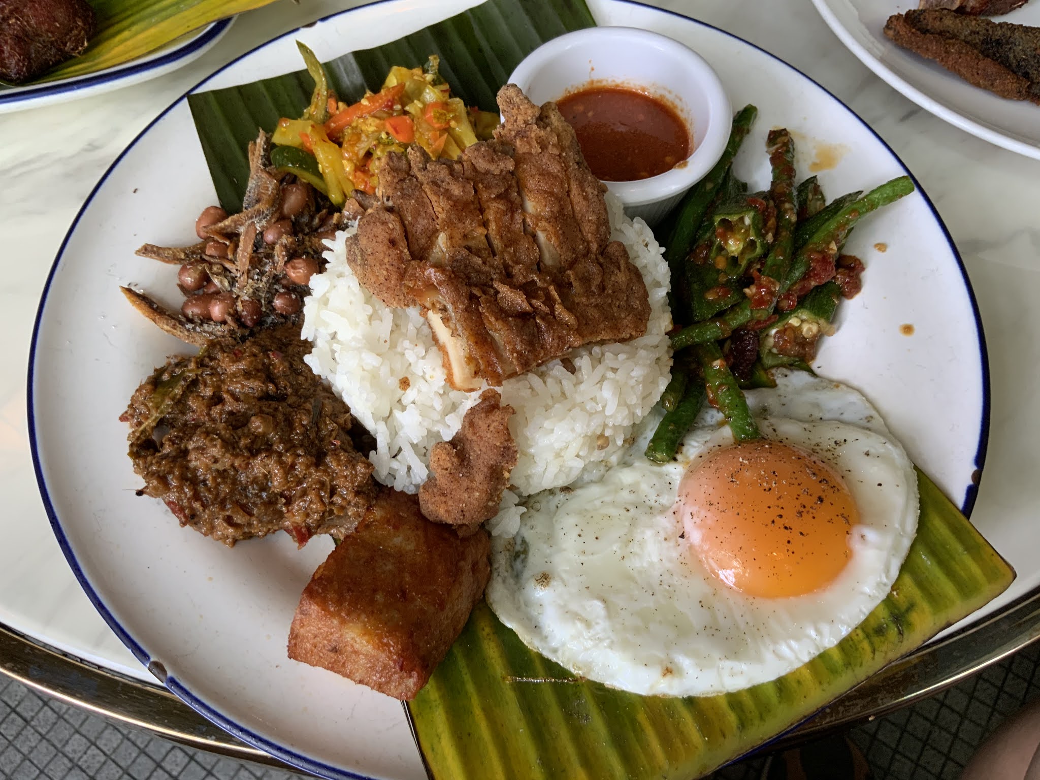
Nasi Campur, © Favian Ee, Apr 2020

© Favian Ee, Apr 2020

© Favian Ee, Apr 2020

© Favian Ee, Apr 2020

© Favian Ee, Apr 2020

© Favian Ee, Apr 2020

Our Table, © Favian Ee, Apr 2020


Saturday, November 19, 2016

Colour Wheels and Colour Harmony

One of the things I learned at the Urban Sketchers Symposium in Manchester this yearn was colour harmony using colour wheels. I took a workshop with the amazing Jane Blundell. She's a watercolour expert, and she taught us about mixing colours and achieving colour harmony using a limited palette. Most of the class saw us painting colour wheels using just 3 colours. But before that, she gave us a quick run through about some important primary colours:

Quick tips on colour

We've all learned about primary colours when we were little. Red, yellow, blue, when mixed in different degrees, produces all the colours of the rainbow. Red and yellow produces orange, red and blue produces purple, while yellow and blue produce green.

But that is just the beginning.


RGB or RYB?

What about computer colours? Why is it RGB (red, green, blue) and not RYB (red, yellow, blue)? Well, that has to do with how light behaves. Colour observed in paintings and prints are subtractive. That means when you add all the colours together, you get BLACK. This happens for reflected light. So when light is reflected off your paper, the pigments absorb different wavelengths of light and you see the reflected result minus the absorbed wavelength. Light from your computer monitor, on the other hand, is additive. That means when you add red, green, and blue, you get WHITE, just like white light can be split into a rainbow. That happens because your monitor is a light source. It is producing its own light, not simply reflecting light like your paper.

One more tip: Our eyes can see a larger range of colours than can be represented with paints or on your colour monitor. Sometimes it may be hard to choose a colour that represents exactly what we see. But don't sweat it. In painting, all colour is representative. Our eyes are constantly adjusting to the changing conditions based on where we are looking and the lighting around us. There's no "true" colour, because the colour we observe of an object is always different at any point in time. Creating a painting is capturing a representation of a scene, even if we adopt a photorealistic style.


Cool or Warm?

We are more concerned with paint pigments here. Non artists may just think in terms of red, yellow, and blue, orange, green, purple, brown, black, white. But there are an infinite number of varieties of each hue. One of the broad ways of categorizing colour is to describe them in terms of warmth. There are cool blues and warm blues, cool reds and warm reds, cool yellows and warm yellows, cool greens and warm greens. When we choose a palette of 3 primaries for mixing, we may choose all warms, all cools, or a mix. I created these reference cards as part of my Sketchpacker kit, and I bring them along in a namecard holder:

Colour wheels using different sets of 3 primaries

Colour Harmony

In each of the colour wheels, I used only 3 colours to achieve all the rest. To maintain harmony, you would want to use colours that fall within the colour wheel. For example, if I'm using Mixed Primaries 1, I can use Sap Green, because it falls within the range between the Hansa Yellow Medium and Ultramarine Blue, even though I didn't use Sap Green to paint the colour wheel. I might not want to use a very cool green like Pthalo Green straight out of the tube without mixing, because it would stand out like a sore thumb. That's generally speaking, of course. Flowers are examples of things with colours that may be vastly different from their surroundings. But even if their colours don't fit into a particular colour wheel, that doesn't mean colour harmony cannot be achieved.

Observed colour is influenced by 3 things: 1) The object's inherent colour, 2) the colour of the light falling on and bouncing off the object, and 3) the colour of the environment bouncing off the object. For example, a red ball placed next to a blue cube will have a bit of blue spill on the side closest to the cube. A colour such as yellow seen under orange lighting will appear more orange, and that same lighting will make it harder to judge blues. I did a painting once in a pub with orange lighting and thought I coloured the skin tones accurately, but when I got out and into the MRT train, I got a shock of my life. I was painting the Simpsons!

Skin tones painted in orange lighting.
I thought I was painting beige. I was actually painting yellow.

If you are aware of how the colour of the object, lighting, and environment affects a scene, you're in a better position to achieve colour harmony.

Staining? Granulation? Opacity? Saturation/intensity? Tonal value? Fugitive?

Watercolours have other properties such as those mentioned above.
  • Staining - How easily your colours can be lifted off a paper using a clean brush and water. Colours which can't be lifted easily and leave a mark are more staining than those that can be lifted easily. Pigments that are ground more finely tend to be more staining. Staining colours tend to produce darker blacks.
  • Opacity and Transparency - More transparent colours will allow the colours under them to show through more. Opaque colours will cover up what is under them more.
  • Granulation - Some pigments will settle unevenly, giving a rough-looking texture that is desirable for some effects. Some pigments interact chemically to create granulation. The result looks somewhat "stoney".
  • Tonal value - How dark a colour is. in the colour wheels above, you can see that Indigo is much darker than Ultramarine at full saturation.
  • Fugitive colours - Some colours will fade when exposed to light. That is why you are not allowed to use flash photography in art galleries, and why your clothes fade after you dry them in the sun over a long period of time. Some colours fade more easily than others. Those colours are more fugitive.
  • "Hue"s - Some watercolour names have the word "hue" appended at the back. That means that is not the true pigment, but a mix of pigments to approximate the original colour. A Cerulean Hue, for example, does not use true Cerulean pigments. Sometimes this is done because the original pigments are no longer available, or they are banned due to toxicity.
More information about watercolour properties can be found here: http://www.watercolorpaintingandprojects.com/basics/properties.html\


Mixing

You can do a lot with just 3 colours! Here are some examples of the exercises we did during Jane's class.

Warm Primaries: Quinacridone gold, Alizarin crimson, Ultramarine


Cool Primaries: Lemon yellow, Perm rose, Winsor blue


Painting fruits with only cool primaries

Final result

So why not try assembling a small pocket palette of your own using just 3 colours? You can pick from the examples above, or try your own.

If you want to find out more about colour, pigments and watercolour properties, handprint.com is an amazing resource.

Thanks, Jane, for all the tips!

Check out Jane's Ultimate Mixing Selection here: http://www.danielsmith.com/content--id-826

Friday, October 5, 2012

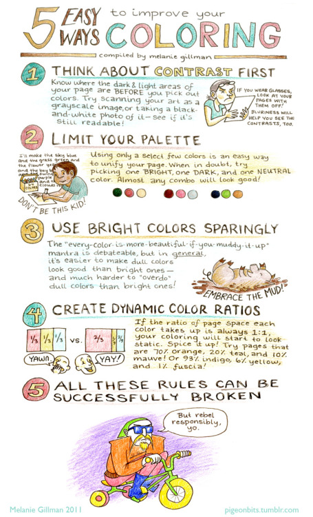
5 Easy Ways to Improve Your Colouring, by Melanie Gillman

Colour can be tricky. The most important thing to know is that even when using colours, you need to know how tones work. Different colours have different values, which you will be able to see when you convert your drawing/picture/photo to black and white. That's the first rule described by Melanie Gillman below. Check out the handout she made for a colouring workshop. It's a great starting point!


Melanie's website: http://pigeonbits.tumblr.com/post/8672102194/a-handout-i-made-for-a-coloring-workshop-im

Tuesday, October 2, 2012

Preparing for a Sketchpacking Trip: Learning to Sketch

What could be more important for a sketchpacking trip than knowing how to sketch? There's something to learn, even for the most experienced sketcher, but for beginners, there are even more things to learn, and it can sometimes be difficult and intimidating to know where and how to start. Many would-be sketchers might think: "I'd love to sketch, but I could never do it. It's too hard!" Well, anything is hard if we think that way, but we'd be missing out on some great fun if we didn't try, right? So I figured I could give a few suggestions.

Expectations
First things first, be realistic. Nobody's going to be a Leonardo or Rembrandt the first time you put your pencil to paper. Great artists get to where they are by drawing everyday for years. It takes not only talent but a lot of discipline, dedication, and commitment. For the casual sketcher who is just starting off, it might be helpful to remember that Leonardo started off where you are now. You are at a point where the greatest artists used to be once in their lives!

Beginning with the Basics
First thing you need to know is what level you are at and what kind of sketching you want to do. Not all subjects or styles require the same skills and proficiency in those skills. If you're content with drawing stick figures and oddly shaped buildings and landscapes that don't look like the real thing, you could very well do without learning some drawing fundamentals. For that kind of drawing, you're probably more concerned with having fun and recording what you feel than recording what you see. But if you want to reproduce what you see and create beautiful looking and convincing artwork, then there are some basic rules you need to understand and learn, such as:
  1. How to handle a pencil
    The humble pencil is perhaps the most versatile tool in your arsenal. It can give you different textures and tones, isn't messy like charcoal, nor unforgiving like watercolours. It can be layered, erased, dark and light, and give you broad as well as narrow lines. It is easy to pick up, and though it takes time and effort to master, it is still easier to become proficient with it than with other media.

    There are several different ways to hold a pencil. Different grips are used for different drawing styles (http://drawsketch.about.com/od/learntodraw/ss/howtoholdpencil.htm). Some grips are better for fine detail, requiring smaller movements from the fingers or wrist. Other grips (like the overhand grips) are better for large broad strokes, which will require you to use the whole arm (from shoulder to elbow).

    Do not underestimate the pencil. Get to know it well, and it will be your best friend.
     
  2. Tone/Value
    Tone refers to the light and dark values. A familiar word may be "shading", but it's actually a little more fundamental than that. "Shading" is made up of tones. It is easier for beginners to work in black and white because handling colour can get quite confusing, but that doesn't mean your drawing will be boring if it's in only 1 colour. When you're able to handle different tones well and know how to use them to create depth, texture and mood in your drawing, you're in a better position to handle colour.

    Getting different tones using the pencil is simply a matter of controlling the pressure with which applying. More pressure = darker tones. Nothing complicated like trying to mix darker blacks (when using paints) or doing cross-hatching (when using pen and ink). The trick is knowing where to put the dark and lights. One tip that artists use to see tonal values better is by squinting. When you squint, you don't see so much detail and colour, which can be overwhelming and distracting when you are trying to get the big picture into your... er... picture.
     
  3. Perspective
    Ever tried drawing a building and felt that it was "not quite right"? Like maybe the ground seems to be ascending into the distance when in reality it's flat, or some objects on the ground seem to be floating in your drawing? It may be because you got your perspective wrong. No, I'm not talking about the way you're looking at a situation. Perspective is the phenomenon where things seem to recede into the distance.

    While people have always seen things in perspective since the beginning of time, rules for perspective drawing were developed and proliferated in the Renaissance period. Yes, that is during Leonardo Da Vinci's time. That's why when you look at some medieval paintings, the ground plane looks quite awkward and the placement of objects in the painting look all over the place.

    Drawing things in perspective is not very difficult. Learning to create perspective lines and knowing how they work can greatly help you keep the subjects in your painting grounded (pun intended). Check out these links on how perspective works and how to use it in your drawing:

    http://en.wikipedia.org/wiki/Perspective_%28graphical%29

    http://drawsketch.about.com/od/perspectivetechdrawing/tp/perspectiveindex.htm
     
  4. Proportion
    When we talk about proportion, we're talking about relative sizes. For example, the length of your arm compared to the length of your leg. That's why some children's drawings of people have arms longer than legs. That may work for gorillas, but unless you're drawing Beast in X-men, they don't work for humans.

    You use proportion when you draw something bigger because it is nearer than something smaller in the distance, or when there are differences in sizes and lengths of objects next to each other (either in 3D space in real life or 2D space on your paper). Learning to see relative sizes can help you indicate distance and size in your drawing when used together with tones and perspective. If you have seen artists hold out their pencil at arm's length, close one eye and look past it to the object they are drawing, what they're really doing is using the pencil to measure the object before they draw it on the paper. Here's how we do it:

    http://www.explore-drawing-and-painting.com/how-to-draw.html

    http://mccdrawing.blogspot.sg/2011/01/using-your-pencil-thumb-to-find.html

    http://www.beginningartist.com/measure-like-artist-drawing-lesson.html
     
  5. Colour
    Trying to reproduce on paper the colour we see in real life can be a challenge for beginners. Our eyes can see a greater range of colour (which are actually different wavelengths of light) than our paints or computer monitor can reproduce. That is why learning a bit about colour theory and how light works can help. If you're doing more cartoony style, trying to reproduce what you see may not be as important as choosing the right colours and colour-combinations to create something pleasing to the eye. A quick search on Google for "colour theory" (or "color theory" if you're American) wih give you many resources to choose from. But if you're just using graphite pencils, this may not be that necessary.

    The way I see it there's a lot more space for artistic creativity in the use of colour, so don't get too hung up on it as if you're trying to do a photo-real drawing.

If you're sketching, it's not so much about creating a photograph with your hand. It's about capturing the essence, the atmosphere, the feel of the environment in that moment in time. Have fun doing it. That's the most important. These tips are here for those who want to get better at creating better drawings, not to rob you of your fun or stress you up by trying to be a Rembrandt or Leonardo.

You can learn these things from books, videos (Youtube is a great resource) or other people. Go to the library, go out with other artists on sketchwalks, go take courses! You don't become an artist overnight or in a weekend (I'm highly skeptical about those books that claim they can take total beginners and teach them to draw within a weekend). It takes time and practice, so don't be too hard on yourself if your drawings don't look like what you had in mind. If you keep at it, you can only get better :)

Tuesday, June 26, 2012

Anyone Can Draw!


If you're a big fan of Pixar like I am, you probably have come across the phrase: "Anyone can cook." It's in that movie about a cooking rat. Yes, it's from Ratatouille, spoken by the character Gusteau.

The story revolves around Remy, the rat who loves to cook, wants to cook. But ask any real chef about rats cooking and they will blanch at the thought. Nothing could be more unthinkable for a chef to have sewer vermin preparing food. Dogs, maybe. But rats? Hell, no!

Thankfully Remy didn't listen to the crowd and went on to be a master chef, impressing even Anton Ego, the vampire-like food critic who didn't believe that "anyone can cook". In fact he impressed Ego so much that Ego changed his mind, realising that "not everyone can become a great artist, but a great artist can come from anywhere".

Some friends tell me they never could draw. What they probably mean is they never seemed able to draw some things well. But I always believed that being able to draw well is not so much about talent, but about passion. If you're passionate about something, you'll find a way to get it done, and do it well. The good thing about passion and skill is that they can be aquired, but it is neither a quick nor effortless process. It is, however, immensely encouraging and enjoyable as you see yourself improving. The screeching of the violin will eventually turn into music, even if you don't become a Paganini.

It was Pablo Picasso who said, "Every child is an artist. The problem is how to remain an artist once he grows up." If you haven't been drawing for the most part of your adult life, don't get discouraged. Pick up a pencil. Doodle. Sketch. Copy. In time you will remember the joy of drawing, and you can pick up where you left off.