Pages

Showing posts with label tools. Show all posts

Tuesday, March 14, 2017

Travel Palette Reviews

It's been a while since I've done any sketching tool reviews. I just ordered a new tool, and I figured why not do a review of a few travel-sized palettes that I own? Now, there are loads of travel palettes out there by different manufacturers in different configurations. These are by no means representative of all of them. They're just a few that I own and have tried. So let's get on with it!

Left to right:
1. Winsor & Newton Field Box
2. Daler Rowney Aquafine Pocket Set
3. Generic metal watercolour box set
4. The Portable Painter
5. Generic bijou box

Ashley 2000R Travel Brush

Ashley 2000R size 5 travel brush, extended
Copyright © Favian Ee  Mar 2017

For size comparison, I've placed my Ashley 2000R travel brush (collapsed) next to the sets. The brush is 11.2 cm long with a diameter of 0.9 cm. It is made of red sable and is size 5, although that hardly means much since different brush makers number the sizes differently.

1. Winsor & Newton Field Box


Winsor & Newton Field Box
Copyright © Favian Ee  Mar 2017

Measuring roughly 12.7(l) x 6.2(w) x 3.4(h) cm when closed, this set is pretty fat, but it's the perfect size for my magazine pouches on my SBO (Skeletal Battle Order). I used this several times when I went for reservist training. You cannot buy this as an empty box. It comes with 12 half-pans of either W&N's Cotman or Artist range. The Cotmans are student grade, so I won't recommend getting those. Better off getting the artist grade paints. If you are in UK, Cass Art sometimes has great discounts for Winsor & Newton sets!

The Field Box comes with the following:
  • 12 watercolour half-pans
  • 1 water bottle
  • 1 travel brush
  • 3 mixing areas (1 on the water bottle)
  • 1 water container (the cap)
  • 1 small sponge (not shown here)

Winsor & Newton Field Box opened
Copyright © Favian Ee  Mar 2017

The box opens up to give you 3 mixing areas. The cap of the box can be latched on as a water container. You can store a maximum of 14 half-pans in this set (it comes with 12) if you remove the sponge, which I never use. The bottom of the box has a ring that you can flip out for you to hold the box in one hand while painting in another

Included brush, opened
Copyright © Favian Ee  Mar 2017

Included brush, extended
Copyright © Favian Ee  Mar 2017

The Field Box comes with a teeny weeny synthetic travel brush that is practically useless for proper painting. It might be useful for getting small details, but I doubt it's good for much else. I almost never use it. Just get a better travel brush.

Pros:
  • Keeps 14 half-pans
  • Self-contained with water container and bottle
  • Ring for holding the box
Cons:
  • Pretty useless brush, but most brushes that come with sets are
  • Large and quite bulky 

2.  Daler Rowney Aquafine Pocket Set

Daler Rowney Aquafine Pocket Set
Copyright © Favian Ee  Mar 2017

This was my very first watercolour set with pans. I bought it when I started urban sketching. It measures around 14.1 x 6.9 x 2 cm and comes with 12 half-pans and a synthetic brush (size 4) that's not as tiny as the W&N Field Box's, but isn't terribly fantastic either. Cheap synthetic brushes seldom are. They don't have the water-holding capacity of real animal hair and tend to discharge their load of water and paint very quickly. But at under $30 SGD, this little baby was a good bargain. Daler Rowney also has a similar box under their Simply range for a few dollars less. Don't even bother with that one, cos Simply is lower grade than Aquafine, which is already student grade. These boxes don't come in artist grade colours though, which is a pity. They're pretty pocketable (duh!) and also have a ring at the bottom for easy holding. Winsor & Newton have a similar Cotman pocket box set that is slightly more compact.

Aquafine Pocket Box, opened
Copyright © Favian Ee  Mar 2017

Unlike the W&N Cotman pocket box, the DR one has an extra groove at the top end. I'm not sure what that is for, but I squeezed more Aquafine colours from tubes into that space. I also squeezed some other colours into the mixing wells to expand my palette. The half-pans are removable.

Pros:
  • Pocket-sized!
  • Cheap
 Cons:
  • Student grade colours
  • Only 3 mixing wells

3. Generic Metal Tin

Generic Metal Tin
Copyright © Favian Ee  Mar 2017

Although the cover says Rembrandt, this kind of tin is actually very common and several brands offer the exact size and configuration for their sets (Schmincke, Pebeo, etc.). I bought this as an empty tin for $20+, but you could get the same kind from Pebeo with 12 half pans of student grade colours at about the same price. The tin measures 12.5 x 7.2 x 2 cm and comes with a mount to secure your half pans inside. There's enough space to store at least 1 travel brush, which is sold separately.

Generic metal tin with 12 half-pans and brush
Copyright © Favian Ee  Mar 2017

This tin is sturdy and has 3 large mixing areas and a plate with 6 smaller ditches for mixing. If you remove the mount and secure the half-pans with tape or blu-tack, this tiny box can fit over 20 half pans! Of course you'd have no space for the brush, but who cares? You can always keep the brush elsewhere.

Generic metal tin with mount removed
Copyright © Favian Ee  Mar 2017

Like the 2 boxes above, this one also has a metal ring on the base to slip over your finger or thumb. It's a solid box, but because it's metal, it can dent, and the enamel may flake off after some time. If you treat the box well, it will serve you well for a long time.

Pros:
  • Can hold over 12 half-pans!
  • Compact with slim profile
Cons:
  • Can get dented
  • Enamel may flake off after some time (durability depends on use and maker)

4. The Portable Painter

The Portable Painter
Copyright © Favian Ee  Mar 2017


This gem is the brainchild of Steve Padden, a painter and a designer of multi-tools. It comes as an empty palette with 12 empty half-pans and a whole bunch of mixing wells. It's a well thought-out palette, but at 14 x 7.5 x 3.2 cm, it is the biggest of the palettes in this review. Unlike the earlier palettes, this one doesn't have a finger ring, but what it has are some other nifty features.

Copyright © Favian Ee  Mar 2017

The grey casing can be separated after removing the securing clip. The clip is the only metal bit on the set. The rest of it is plastic. The 2 halves of the casing serve as water containers and can be latched on to each side of the palette.

The Portable Painter, expanded
Copyright © Favian Ee  Mar 2017

The palette comes with a whopping 13 mixing areas. The half-pans are removable. Unlike the Aquafine pocket set, they are not very secure. You'll probably want to use some blu-tack to keep them in place.

Copyright © Favian Ee  Mar 2017


The palette comes with a nested synthetic brush that gives you 2 different-sized round heads. The brush groove can easily fit my Ashley 2000R travel brush. Thicker travel brushes may not fit in the groove.

Copyright © Favian Ee  Mar 2017

Unlike the above 3 sets, the Portable Painter is not built to be handheld. However, it is built to be hands-free. Here it is fully assembled. You'll have to find a place to keep the metal clip though.

Portable Painter assembled
Copyright © Favian Ee  Mar 2017

So, if you can't hold it to paint, where can you put it? Well, it boasts being able to stand on any surface. Guess that's the plus point for having 2 'legs' rather than just one flat base to sit on. But not only can it stand on its legs, its legs can be used to straddle your leg!

Portable Painter on my leg
Copyright © Favian Ee  Mar 2017


It sits pretty securely on my leg at least. Not sure if your leg is much skinnier. If you have big thighs, I think doing this may be pretty difficult. But hey, it's the only palette out there that has this feature as far as I'm aware.

At $30 USD on Indiegogo, this is a very affordable option. It is well-designed and sturdy. One drawback is that the water containers fit around the palette pretty tightly, which means if they are dirty with pigments, they may stain or dirty the outside of the palette when you put it all together. Also, there's no bottle like the W&N Field Box where you can store dirty water, but you can always bring your own bottle. You can always just bring the palette out if you prefer. It would occupy much less space and you won't have to worry about misplacing the metal clip.

Pros:

  • Totally hands-free!
  • Loads of mixing wells
  • 2 water containers

Cons:

  • Pretty big
  • Might not fit people with big thighs
  • Nowhere to store/dispose of dirty water from containers
  • Containers need to be cleaned before reassembly to avoid staining the outside of the palette

5. Bijou Box


Metal Bijou Box
Copyright © Favian Ee  Mar 2017

This small metal tin is truly pocket-sized. It measures just 8.1 x 6.3 x 1.6 cm and still manages to fit a total of 12 half-pans. It's shorter than any travel brush out there, but nothing is stopping you from buying a normal brush and chopping off the handle. You'd just have to remove 4 half-pans to fit your brush.

Bijou Box opened
Copyright © Favian Ee  Mar 2017

The half-pans are secured with V-shaped fasteners which slide inbetween each row of pans. It has a metal ring on the base and enamel mixing areas. With just 2 mixing wells, it is a bit low on mixing areas, but that should be fine if you're not dealing with too large paintings.

I bought this box empty without any pans. The pans I bought separately and filled with paints from tubes. This set currently serves as my mixing primaries palette.

Pros:
  • Super compact yet stores as many colours as the larger ones above
  • Sturdy metal casing
Cons:
  • Only 2 mixing areas
  • No space to store a brush

Height Comparison

Here's a photo with the relative heights of the boxes I reviewed:

Copyright © Favian Ee  Mar 2017

Water Containers

Most of these watercolour box sets don't come with a water container/bottle, except for the W&N Field Box. There are other sets that do. But really, you don't need to specially get a box that has one. You can use anything convenient as a water container from film cartridge boxes (a rarity these days), small bottles, or makeup containers. Just make sure they're water-tight! Here are 3 containers (out of several) on my desk. The one of them is a mini Nutella container. You can use mini jam jars, but glass is heavy. The plastic bottle on the right holds a fair bit of water and is watertight. You can get these from the dollar store or convenience stores or art stores. Or you can save your bottle of peanut butter after finishing up the contents. Or you can buy collapsible or nested water containers from your art/stationery shop. The options are limitless.

Water containers
Copyright © Favian Ee  Mar 2017


Well, I hope you enjoyed this review. Feel free to share your own boxes!


P.S. Some of my other tools from years ago:
http://www.parkablogs.com/content/art-tools-of-favian-ee

Saturday, November 19, 2016

Colour Wheels and Colour Harmony

One of the things I learned at the Urban Sketchers Symposium in Manchester this yearn was colour harmony using colour wheels. I took a workshop with the amazing Jane Blundell. She's a watercolour expert, and she taught us about mixing colours and achieving colour harmony using a limited palette. Most of the class saw us painting colour wheels using just 3 colours. But before that, she gave us a quick run through about some important primary colours:

Quick tips on colour

We've all learned about primary colours when we were little. Red, yellow, blue, when mixed in different degrees, produces all the colours of the rainbow. Red and yellow produces orange, red and blue produces purple, while yellow and blue produce green.

But that is just the beginning.


RGB or RYB?

What about computer colours? Why is it RGB (red, green, blue) and not RYB (red, yellow, blue)? Well, that has to do with how light behaves. Colour observed in paintings and prints are subtractive. That means when you add all the colours together, you get BLACK. This happens for reflected light. So when light is reflected off your paper, the pigments absorb different wavelengths of light and you see the reflected result minus the absorbed wavelength. Light from your computer monitor, on the other hand, is additive. That means when you add red, green, and blue, you get WHITE, just like white light can be split into a rainbow. That happens because your monitor is a light source. It is producing its own light, not simply reflecting light like your paper.

One more tip: Our eyes can see a larger range of colours than can be represented with paints or on your colour monitor. Sometimes it may be hard to choose a colour that represents exactly what we see. But don't sweat it. In painting, all colour is representative. Our eyes are constantly adjusting to the changing conditions based on where we are looking and the lighting around us. There's no "true" colour, because the colour we observe of an object is always different at any point in time. Creating a painting is capturing a representation of a scene, even if we adopt a photorealistic style.


Cool or Warm?

We are more concerned with paint pigments here. Non artists may just think in terms of red, yellow, and blue, orange, green, purple, brown, black, white. But there are an infinite number of varieties of each hue. One of the broad ways of categorizing colour is to describe them in terms of warmth. There are cool blues and warm blues, cool reds and warm reds, cool yellows and warm yellows, cool greens and warm greens. When we choose a palette of 3 primaries for mixing, we may choose all warms, all cools, or a mix. I created these reference cards as part of my Sketchpacker kit, and I bring them along in a namecard holder:

Colour wheels using different sets of 3 primaries

Colour Harmony

In each of the colour wheels, I used only 3 colours to achieve all the rest. To maintain harmony, you would want to use colours that fall within the colour wheel. For example, if I'm using Mixed Primaries 1, I can use Sap Green, because it falls within the range between the Hansa Yellow Medium and Ultramarine Blue, even though I didn't use Sap Green to paint the colour wheel. I might not want to use a very cool green like Pthalo Green straight out of the tube without mixing, because it would stand out like a sore thumb. That's generally speaking, of course. Flowers are examples of things with colours that may be vastly different from their surroundings. But even if their colours don't fit into a particular colour wheel, that doesn't mean colour harmony cannot be achieved.

Observed colour is influenced by 3 things: 1) The object's inherent colour, 2) the colour of the light falling on and bouncing off the object, and 3) the colour of the environment bouncing off the object. For example, a red ball placed next to a blue cube will have a bit of blue spill on the side closest to the cube. A colour such as yellow seen under orange lighting will appear more orange, and that same lighting will make it harder to judge blues. I did a painting once in a pub with orange lighting and thought I coloured the skin tones accurately, but when I got out and into the MRT train, I got a shock of my life. I was painting the Simpsons!

Skin tones painted in orange lighting.
I thought I was painting beige. I was actually painting yellow.

If you are aware of how the colour of the object, lighting, and environment affects a scene, you're in a better position to achieve colour harmony.

Staining? Granulation? Opacity? Saturation/intensity? Tonal value? Fugitive?

Watercolours have other properties such as those mentioned above.
  • Staining - How easily your colours can be lifted off a paper using a clean brush and water. Colours which can't be lifted easily and leave a mark are more staining than those that can be lifted easily. Pigments that are ground more finely tend to be more staining. Staining colours tend to produce darker blacks.
  • Opacity and Transparency - More transparent colours will allow the colours under them to show through more. Opaque colours will cover up what is under them more.
  • Granulation - Some pigments will settle unevenly, giving a rough-looking texture that is desirable for some effects. Some pigments interact chemically to create granulation. The result looks somewhat "stoney".
  • Tonal value - How dark a colour is. in the colour wheels above, you can see that Indigo is much darker than Ultramarine at full saturation.
  • Fugitive colours - Some colours will fade when exposed to light. That is why you are not allowed to use flash photography in art galleries, and why your clothes fade after you dry them in the sun over a long period of time. Some colours fade more easily than others. Those colours are more fugitive.
  • "Hue"s - Some watercolour names have the word "hue" appended at the back. That means that is not the true pigment, but a mix of pigments to approximate the original colour. A Cerulean Hue, for example, does not use true Cerulean pigments. Sometimes this is done because the original pigments are no longer available, or they are banned due to toxicity.
More information about watercolour properties can be found here: http://www.watercolorpaintingandprojects.com/basics/properties.html\


Mixing

You can do a lot with just 3 colours! Here are some examples of the exercises we did during Jane's class.

Warm Primaries: Quinacridone gold, Alizarin crimson, Ultramarine


Cool Primaries: Lemon yellow, Perm rose, Winsor blue


Painting fruits with only cool primaries

Final result

So why not try assembling a small pocket palette of your own using just 3 colours? You can pick from the examples above, or try your own.

If you want to find out more about colour, pigments and watercolour properties, handprint.com is an amazing resource.

Thanks, Jane, for all the tips!

Check out Jane's Ultimate Mixing Selection here: http://www.danielsmith.com/content--id-826

Monday, August 24, 2015

Home-made Watercolour Sketchbooks

What inspired me to go through all the trouble to make my own watercolour sketchbooks? It's silly looking back at it. I was packing my sketching kit for my upcoming trip and thought that lugging a whole Moleskine watercolour journal would be a bit too much, so I figured since I had a sheet of Strathmore Imperial paper lying around, I might as well use that and make my own sketchbook. I didn't need a whole Moleskine's worth of pages after all, I reasoned. But when I discovered that I would only be able to get 13 A5-sized leafs (26 pages) out of one sheet, I realised I probably needed to make 2 books and bring only one out at a time.

And so I did.

I didn't take photos of the process, unfortunately, but here are some photos I did snap after making the first one.


Double rubber bands. I forgot to include them for the 2nd book.

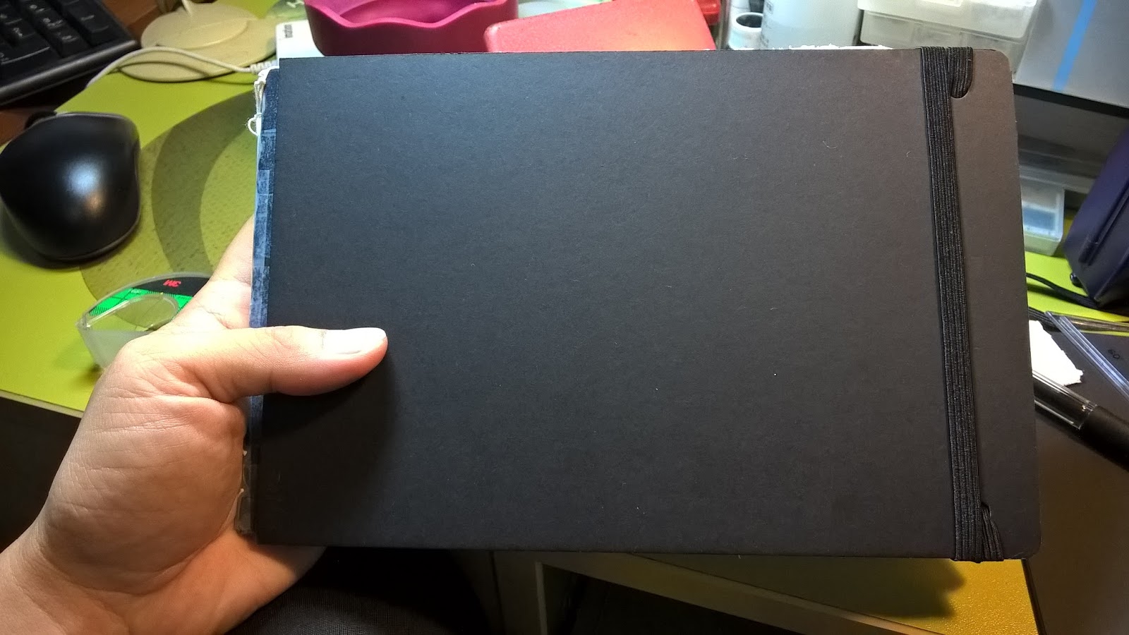
This is how thin the books are. This one uses 300 gsm Saunders Waterford.

The cover is made of 1 folded card and another couple of cards pasted over the outside.

The pages are not sewn but bound by thread so they can be removed and bound after the trip.

Back page is about 1/2 page. Can be used for testing watercolours.

This is the second sketchbook in progress. This one uses the Strathmore Imperial.


The 2nd cards haven't been glued yet. I totally forgot to put in the rubber bands for this one.
In the end, the 2 sketchbooks weigh more than 1 Moleskine. However, since I'm bringing only one around at a time, my purpose is still fulfilled.

I'm Going on an Adventure!

I've barely finished my sketches from my Hong Kong trip in April, Bandung trip in May, the Urban Sketchers Symposium in July, and my mini personal project over Singapore's Golden Jubilee weekend, and I'm about to embark on another trip! Whereabouts? Aotearoa - the Land of the Long White Cloud. A.k.a Middle Earth, a.k.a. New Zealand. This will be my last major trip in a while, I expect.

I started putting together my sketch kit a few weeks back. I told myself that since I'll be going on a coach tour and staying at a different hotel every night or every few nights, I ought to keep things compact and light. And I'm not a light packer by nature, cos I tend to pack for contingencies. Then it happened. Again.


Sigh....

I guess that's the "packer" in Sketchpacker. And I haven't even included my marker set in the photo.

Why so many things, you ask. Well, mainly because I draw in different styles. One of those styles happens to be the comic style I use for my Sketchpacker comic stories, and it uses a specific set of tools, namely felt-tip markers and pens (top row and 2nd row middle). It also requires A5 portrait format paper, hence 2x Daler Rowney Graduate sketchbooks (bottom left).

But I'm going to New Zealand! Land of Hobbits and Elves! I can't visit the place without decent watercolour paper and materials! So in an attempt to lighten my daypack ever-so-slightly, I made 2 of my own watercolour sketchbooks (bottom right) using one sheet of watercolour paper each (1 sheet of Strathmore Imperial which I've had for a long time, and 1 sheet of Saunders Waterford). I'll be carrying only 1 about and leaving the other in the luggage till the first is finished.

But watercolour paper is terrible for pencilwork! I found a landscape A5 Daler Rowney Graduate sketchbook, which I made by chopping an A4 one into half, sitting on the shelf.

But what if I need something palm-sized? So the Perfect Sketchbook and the Seawhite A6 landscape (middle right) came to be in the kit - the first for watercolour, the second for dry media.

The 2 small A6 notebooks at the bottom left are from Muji for writing notes.

I'm such a SketchPACKER... I bet Bilbo didn't bring as many things on his adventure... And that's not mentioning my necessities, clothing, SLR + 2 lenses, and an Irish whistle. Packed in to 2 separate bags. I must be crazy...


P.S. When a couple of friends found out I was going to NZ, they realised why I was bringing so many materials. Much to draw (I hope!) and not much chance to replenish materials. I'm vindicated!

Saturday, March 14, 2015

Packing for Hong Kong

It's almost time for another holiday! Woohoo!

Last year, a colleague of mine came back from Hong Kong. I asked him how his holiday went. He said he enjoyed it, and immediately proceeded to ask if I would like to go there with him on a sketching trip. I was surprised, to say the least. He had just come back and he was thinking of going again! It wasn't long before we booked our flight and managed to find a nice little apartment with 2 separate rooms on AirBnB. We will fly in less than a month.

The last time I visited Hong Kong, it was still under British rule. That was probably around 1990. Over the last year or so, it has been on my mind to go back. It was nearby, relatively inexpensive to fly there, had great food, and had people I knew. Back in 2012, I visited Perth and ran into a young lady sketching the train station. She was from Hong Kong. Just last year I got to know some of the leaders of Urban Sketchers Hong Kong, and after the publication of my Sketching Georgetown 2 book, one of them asked when I would go and do one of Hong Kong. Hence when my friend asked if I was interested to go, I didn't hesitate to sign up. I'm sure a lot has changed in those 25 years.

Deciding what to bring for sketching on a trip is always a challenge. I keep telling myself "less is more", but then I start to worry about not having something I'd want when I need it. Keeping a kit small and versatile at the same time can be difficult for one who has the tendency to switch media quite often (not the best thing to do if you're trying to master a particular medium). But I think I've settled with this:


Top left:
  • Faber Castell Pitt Artist Pen set in a Lihit Lab pouch
  • 4x Sakura Pigma pens
  • Faber Castell Pitt Artist Pen big Cool Grey III


Top right (main kit 2):
  • Sakura Micron pens
  • Derwent Graphik Line Maker (grey) x 3
  • Clutch pencil
  • Kuretake disposable pocket brush super fine
  • Delfonics pen wrap


Middle right:
  • Watercolour travel set


Bottom left (main kit 1):
  • Kuretake 2-sided disposable pocket brush medium + fine
  • White gel pens
  • Faber Castell Pitt Artist Pens (cool grey)
  • Erasers
  • Mechanical pencil
  • Muji pencil case


Bottom middle:
  • Mechanical and clutch pencils, 2mm leads of different grades (2B, 4B, 6B)


Bottom right:
  • Waterbrushes of various widths and brands
  • Travel brushes
  • ArtGraf water-soluble graphite
  • Water spray

As for sketchbooks......


Left: Clairefontaine Goldline A5
Top right: The Perfect Sketchbook A6
Bottom right: Muji notebook for trip notes and journaling

The Clairefontaine is a tad heavy, but it has a hard back, which will be very helpful if I do pencilwork. I used a paperback Daler Rowney Graduate book in Penang, which was good enough for the Pitt markers and suitable for pencilwork. I could bring 2 of those in my Muji hard-back sleeve (which would be lighter) if 1 weren't enough, but I thought I'd try this out since I bought it a while back and it's been sitting on my shelf.

The Perfect Sketchbook is the brainchild of one of my friends, who successfully funded a Kickstarter project to produce this little beauty.

The Muji notebook is not for artwork. The paper isn't good and ink easily bleeds through. It's just for notetaking and keeping a record of important info, like flight and accommodation info.


It's about time for another holiday. Work over the last few months has been hectic, to put it mildly. On top of that I'm involved in other projects and commitments that also take up time and energy. A little diversion is good, even if it probably means starting yet another project (Sketchpacking Hong Kong: A Sketchpacker's Diary, perhaps?). I hope I don't kill myself :P

Wednesday, April 23, 2014

Pocket School-Grade Colour Pencils

Staedtler, Koh-I-Noor, and Faber Castell
school-grade pocket colour pencil sets


I have 3 sets of cheap pocket-sized colour pencil sets and decided to do a review of them after testing them out. These are easily obtainable at neighbourhood bookstores like Popular (except for the Koh-I-Noor in the middle, which I got from Overjoyed) and cost only around $2 SGD. Faber Castell even has a watercolour pencil version. I bought them because they were a handy size and cheap. A lot easier to bring around than my artist quality set (below):

I've recently reconfigured this set, which now contains
Prismacolor and Derwent Colorsoft pencils only.

You can't compare the quality of school-grade products with artist-grade ones, of course, but my pencil roll is not very light, and I don't use the whole range too often. Neither am I keen on sawing the pencils in two. The pocket sets were acquired for convenience. Nothing else. But out of curiosity, I took them out to compare them with each other. Here are the results:

Test was done on a Daler Rowney Graduate A5 sketchbook

How do they compare with my Prismacolors? Honestly, they suck. But what do you expect when a single Prismacolor pencil costs more than a whole box of student-grade pencils? The colours may look pretty saturated in the scan, so here's a photo:


It took quite a lot of pressure to get the colours at this intensity (i.e. I had to press pretty hard). The pencils don't contain a lot of pigment. You will notice that while each set contains 12 colours, there are slight variations. For example, Staetdler and Faber Castell both have beige - though different shades - while Koh-I-Noor doesn't. Faber Castell has GOLD while the other two have an additional shade of red in its place. The details of my findings are in the scan above, but to summarize it, I like Faber Castell's for its intensity and softness, while I prefer Staetdler's colour range. I like the Koh-I-Noor set least. If you look closely, the colour swatches aren't even and there's quite a bit of speckling going on. Maybe I got a lemon, but I'm not going to buy another set to try. Feel free to do so, though. It's only about $2 a box, and if you don't like it, you can give it to your kid or nephew/niece.

In light of this, I think I might go dig out my Global Art pencil case and use that in place of the pencil roll. It can't take as many pencils, but at least I can carry GOOD colour pencils around.

Global Art 24 pencil case


Thursday, February 20, 2014

A4 Portrait to A5 Landscape Sketchbook Mod

Sketchbook options in Singapore are somewhat limited, especially for those like me who like to vary their media, and who like the A5 landscape format. You can find decent A5 landscape watercolour sketchbooks such as Etcetra, Moleskine, and Strathmore, but the only A5 landscape format sketchbooks I've found for other media are either Daler Rowney's Original Classic Cachet sketchbook or the cheap stuff you get in neighbourhood bookstores, which are not of very good quality. Daler Rowney's Cachet A5 landscape sketchbook is also strictly for dry media. It buckles upon application of water, and quite badly. The only other decent option is the Sketch2book, a specialty sketchbook designed and produced by one of my friends, which is actually 2 sketchbooks in one - one side in portrait format and the other side in landscape (see below). It is a versatile sketchbook that takes ink, markers, light wash, pencils, and other dry media very well. However some might find it a little heavy (after all, it's 2 books with a hardcover), but apart from that, I love it. It is available through Arters, an online shop based in Singapore, which also stocks Daniel Smith watercolours and other sketchbooks.

Sketch2book, an A5-sized
landscape-cum-portrait format
conjoined sketchbook

Multimedia sketchbooks are not that difficult to find here, actually. It's just landscape format ones that are hard to find. Art Friend brought in some stock of Daler Rowney's hardcover Graduate series sketchbooks a while back, but the only landscape ones available were A4 size, and they were snapped up very quickly with no sign of replenishing stock. I actually like the Daler Rowney Graduate series, even though it is more towards the "student quality" grade. Despite that, I have found it to be suitable for dry media, markers, ink, and light watercolour wash. It's very versatile, but it doesn't come in A5 landscape.

At least not with some handiwork.

Daler Rowney Graduate A4 hardcover landscape sketchbook

Just a few days back, an idea occurred to me. I had a spare unused Daler Rowney A4 paperback portrait sketchbook lying around. What if I cut it down the middle? I'd get 2 landscape sketchbooks! So, that's what I tried today, and I took photos of the process. Here they are:

First, get yourself one of these. One of the
best things about this sketchbook is
they're very cheap.

Open it up and remove the staple binding.

The sketchbook is quite thick, so it might
not be advisable to put the whole thing
through the cutter. I separated the sheets
and cut a few at a time.


Hold the sketchbook firmly as you chop it
in half. Don't let it slip or you will get a
curved edge.

Aaand.... you get 2 halves!

Each half is a landscape A5 sketchbook!

Now to bind the pages back. If you have a long-arm stapler, good for you.
If you don't, get a sturdy stapler and lay the sketchbook flat like this
on a thick piece of corrugated cardboard (or a few layers of it).

Align the stapler head with the spine, and punch the staples right through.
***DO NOT try to do this flat on your tabletop - unless you want holes in
your table!!

The result should look like this. My alignment is a bit off though.

Close the staples to finish the bind.

Completed modified sketchbook.

Wait. There's 2 of them!

So that's how you do it! Two A5
landscape sketchbooks for the price
of one A4 portrait one!

Halved A4 portrait sketchbook compared with A5 portrait sketchbook.
Both are readily available from Art Friend, but you'll have to cut
the A4 one yourself if you want it in A5 landscape.

The Graduate sketchbook may not have archival paper, but it is acid free. That's good enough for most of us. If you find it flimsy because of its soft cover, you can always bring a clipboard out, or make your own hardcover jacket. I haven't tried that yet, but may do so sometime later.

One more important thing to note is that the Graduate soft cover sketchbooks comes in 2 different paper weights - 140 and 160 gsm. The ones I use are 160 gsm and can be identified by their matte cover (the 140 gsm ones have a glossy cover). Actually there are 4 different paper weights in this range, which you can check out at their website. The whole range is not available in Singapore, unfortunately, so I just have to make do with what I can get. The A5 portrait one is only about $3 here, and the A4 can't cost much more. This is way cheaper than a Stillman and Birn, which costs about 6-8 times more, and even cheaper than Moleskines which will cost 10 times more for less pages of watercolour paper. Those on a budget (like students) might find this a good alternative, especially for more casual work. The only thing you will need to cut the sketchbooks is access to a paper cutter. Of course, you can easily do it sheet by sheet without one, but that's a lot more troublesome.

The following are some samples of artworks done using the A5 portrait 160 gsm one:

Copyright © Favian Ee  2013
Drawn with ink and watercolour, watercolour pencils,
water-soluble graphite, felt-tip pens/markers, and gel pen.

Copyright © Favian Ee  2013
Drawn with ink, felt-tip pen, and water-soluble graphite pencils

Copyright © Favian Ee  2013
Drawn with Faber Castell Pitt pen markers

Hope you found this helpful!